Monday, June 14, 2010

artistic expressionism


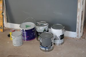
Much to everyone's surprise we decided to paint our apartment with actual colours instead of the usual safe white or cream that most tend to run with. The colour scheme is pretty much grey and white. We used Nippon Parma for the lounge-hallway-kitchen and a darker grey for the bedroom. It's all about creating a mood. If you look at any interior designer's portfolio you will see that white or cream walls are rarely featured, and having a 'designer' look is what we are trying to encapsulate. Some may think it is too dark, but we believe the walls will look striking once it is furnished.The white glossy skirting borads, window sills and doorframes will contrast and give the apartment more depth. 

3 coats plus a sealer on the ceiling, and two coats on the walls = very tired arms!!! This is a hard gig so kudos to all the professional painters out there. Another difficulty was paining the up in the shadow line neatly, but we managed in the end. And we are glad we decided to take the risk because it looks awesome.

ceiling the deal


The gyprock was delivered and installed the very next day. It was all up in 24hrs, then two days to sand it all back and finish it off. It's hard to see in the photos but we decided on having a 'shadow line' finish, which basically means it looks as though the ceiling is 'floating'. It looks really good, clean and modern. Now to drill the holes for the downlights and give it a few licks of paint.

how to grout


The grout is added to finish the tiles and thankfully it is not as tedious as laying the tiles themselves. Once it starts to dry, just wipe off with a wet rag until they come up all shiny and nice. Easy. Except it still took about 3 hours, but we also had to 'cut and paste' a few random tiles here and there in that time. Hmmm, this reno business is hard work.

Wednesday, June 2, 2010

tiles

In keeping with our black grey white colour scheme, we set off looking for some tiles for the kitchen and balcony. We essentially wanted the two to be of the same colour, so that the apartment wouldn't look too mis-matched. Being in two different parts of the apartment, we wanted to tie the two together visually, and so we thought we would look for a tile that came in two different finishes - polished for the kitched and a honed (matte) for the balcony. 

It was not as easy as we thought. Most tiles have slight grains, veins or patterns and we wanted a flat medium grey because the stone benchtops and marble splashback have enough texture in them already.After browsing a few stores we had almost given up for the day and headed for the car when out of the corner of my eye I spotted it. A big sign that said SALE, and underneath, a big pile of grey tiles in exactly the style we were looking for. We bought 600mm x 600mm for the kitchen in polished, and 300mm x 300mm for the balcony. 7sqm each. Parma from Hardware and General.


Tiling is not an easy job, particularly if you've ripped out a previous kitchen and used a jackhammer on the ground to remove tiles stuck on with 35yr old glue. We already poured levelling concrete but that is only to make it easier, not make it perfectly flat. So when it came time to lay the tiles we encountered a few problems. Keeping all four corners flat the the cement is very hard on an uneven surface. But we got there in the end, and after taking a second look, it actually came up pretty well. Here's hoping the balcony will be easier.

Sunday, May 30, 2010

rendering

Rendering sounds like it needs to be done by a professional, and in most cases it does, but not for us, our motto at the moment is "Who needs a professional when we can do it ourselves!". We realised that because of the massive gaps ripping out the old kitchen created, there were planty of holes and panels that needed filling. It actually came out looking pretty good. A lick of paint over the top and you'd never know.


Burning the midnight oil

lights, camera, action

Our electrician came to visit and help us decide where to put the power outlets, the light switches, dimmers and of course, the lights. One of our big decisions was whether to build a false ceiling  throughout the apartment so that we could have downlights rather than a few hideous pendants. As per our usual form, we changed our minds a number of times, and we ended up going forward with the false ceiling plans. It's not a decision you can make lighty, excuse the pun, because it is so costly. For an apartment our size, you're looking at about $3,500 - $4,000 for gyprock and installation. Lights are not included people. It is expensive, but a must if you want to achieve a certain 'look and feel'. We will finish our new ceiling with a shadow line, and 22 white downlights. Yes, you heard correctly, 22! I couldn't believe it myself when i heard. We are going to light up like a Christmas tree at night, or worse, melt away under there incandescent glow. Either way, it will 'look' pretty amazing. And the reason for so many lights, we had to align them so they didn't look haphazard.


level 2

Once the kitchen was pulled out, all that was left was a dirty great big cavity with chunks of cement missing, pipes and wires protruding from every surface. We had to level the foundation by pouring levelling concrete so that the tiles would lay flat and even.


and so the fun begins...

The renovations are in full swing though with all the nasty appliances business going on i have neglected to post any photos of the fun we have been having. I will endeavour to start from the beginning, which is the demolition of the kitchen walls and laundry, and everything in between.

Before


After

The demolition took a full day plus an hour here or there and a skip was hired for the rubbish removal, and came and went the same day. It was hard work but to get it all done and dusted in a day was relieving. The boys all worked very hard. We salvaged a number of items for re-use including the oven/cooktop, dryer and even the kitchen sink, all donated to a good cause.

clive peeters... not so easy!

It has been a rough couple of weeks. Firstly, our appliances were not delivered when they were supposed to be. We were told they had been delayed along the way somewhere. Yeah right. Secondly, the very next day, it was announced on national television that Clive Peeters had gone into administration and that all goods and orders had been frozen. Great. Trust us to buy everything from a company teetering on bankruptcy. After four agonising days of feeling robbed, we were told that we would recieve the oven and cooktop, with a question mark still held over the dishwasher we ordered. Being a new model, we had been waiting for it to pass through customs. 2 is better than none I suppose. 

And then a stroke of luck, the administrators announced that everyone who had paid in full (thankfully we fall into this category) would receive their orders within a couple of days. Awesome, and they actually stuck to their word. Well we received all but the dishwasher so let's keep our fingers crossed it turns up!

Wednesday, May 5, 2010

life's good

Over the weekend, we went appliance shopping. We already bought this LG Washer/Dryer Combo from Winning Appliances Sale a few weeks back, and so we thought we would try to tie that in with the rest of the appliances seeing as though it will be on show in our kitchen. Off we went to Clive Peeters and they were so friendly and helpful, that we walked out with everything we needed, and a big discount to boot.
 
LG 8.5/4.5kg Combined Washer/Dryer

White 8.5/4.5kg Combined Washer/Dryer with 10 Year Direct Drive Motor Warranty providing less noise, less vibrations & greater durability, space saving 2 in 1 unit, Pause & Add Function, 4.5 Star Water Rating on the wash cycle, load sensing to optimise wash time, rinse and water consumption and has 1400rpm. And the best bit, it lights up like a Christmas tree!

 
LG 55L Oven with Full Glass Triple Glazed Angle Free Door

Stainless steel finish, featuring a triple glazed glass door with your safety in mind, this helps reduce the heat on the oven glass and comes with 7 cooking functions and a child lock. If only we could have afforded the Pyrolytic version - it self-cleans, what a dream.


LG 600mm 4 Radiant Ceramic Cooktop

600mm ceramic cook top features 4 radiant cooking zones, electronic touch control, rapid head up, residual heat indicator, automatic off for spillage and a child lock. So not only does it look great, but it is packed with additional safer features for your peace of mind. No more fiddly buttons!
LG 14 Place Setting Stainless Steel Dishwasher

Stainless Steel Dishwasher with 14 Place Setting, half load option to save time and water and delay start for 1-19 hours for your convenience, Hybrid Dry combines ventilation and condensing drying for optimum drying performance. Yay, I can do a soft wash on top for my precious wine glasses and a heavy wash on the bottom for pots and plates. Fabulous idea.
 

All together i think we spent around $4,200 for the lot which is pretty good. The washer/dryer alone retails at about $1800, but we got it on sale for $1200 brand new and delivered 3 days later. I had never really considered LG for the appliances in the kitchen, i thought they only did TV's and White goods. I suppose they fit in the middle of the price range for most items, let's hope they sit at the top when it comes to quality. They sure look good, all matching and handsome.

Tuesday, April 27, 2010

mirror mirror on the wall


We have been looking for a mirror to grace the wall of our hallway for some time but they are so expensive. $600-$700 for a fairly standard silver or gold framed mirror is a little over our budget. I found one at IKEA but it had a plain white laminated frame, which would have matched our colour scheme but it looked so cheap, so no match. The two pictured here are currently on eBay for half the price and so now we just need to decide which one is more suitable. The top one is 1640mm x 640 and the bottom one is 2100 x 885. They're huge which is just what we've been looking for. The hallway is long, more like a corridor, with a cupboard on one side and nothing on the other, so that is where it will live. Which one do you like best?

thanks for the komplement


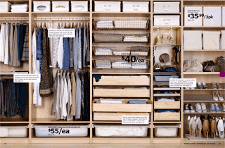
I would do anything to have this amazing storage system behind sliding doors in my bedroom. Did you hear me ... anything!!! The space we have is slightly smaller that the one shown here in the IKEA Wradrobe Catalogue and so i am going to improvise and use this design as my insiration. 
Collectively, we have over 100 pairs of shoes, and before you sigh and blame me, most of them actually belong to Matt. So, a shoe cubby is a must. Also a must is ample hanging space, drawers for the lacy knickers ha ha just kidding, I mean underwear and the like, somewhere for the tonnes of expensive jewells to bask in all their glory (ok there is no expensive jewellery, but there are plenty of plastic adornments that need a home!) and somewhere to store all those folded items like t-shirts and singlets.


This is my version of the storage system, which will hide behind 3 mirrored sliding doors. The left-hand side is specifically designed for a female, with 4 baskets for underwear, shirts etc, 4 jewellery storage trays with 9 compartments, a long hanging space for dresses and coats, and a space for shoes. 

Komplement Wire Basket from IKEA, $20 each

Komplement Storage Tray with 9 compartments from IKEA, $50 each

Komplement Storage Boxes from IKEA, $45.99 / 3

Having such a small space means we need to utilise every milimetre of space as best we can. The Komplement Boxes are a great way of hiding all those unslightly objects or mess of random bits & bobs in a neat minimal fuss way. They have a fabric strap which enable easy access, particularly when they are on a high shelf. The Komplement Storage Tray is the best thing I've seen since sliced bread, and it comes in three different sizes. We will have to go with the smaller size because of our space constraints but it will work just as well. No more lost earrings! Good one IKEA. And a big thank you in advance to my step-father who will be custom building it for us.

colour chamelion


 Heavy Metal 427     Imperial Mist 403    Diamond White 419

We have refined our colour scheme down to 3 for the walls, skirting boards and ceiling. I mentioned in a previous post that we wanted to stick with cool greys along with black and white as our main colour palette. Almost any colour combination will match this palette, and so we think it's a good choice whether we live in the apartment, or we rent it out to another lucky resident. 

The colours are Diamond White 419, Imperial Mist 403 and Heavy Metal 427 from British Paints. It's an Australian company (as the name suggests ??) with an excellent product so it was an easy choice. Diamond White 419 will be used on ceilings and skirtings, doors and frames. Imperial Mist 403 is to be painted on the walls of the kitchen, lounge/dining and hallway. For the bedroom, we are changing the mood a little and going for a deeper darker palette of Heavy Metal 427 on the walls. There will be no feature wall in my house, an awful concept that should be left in the early 90's. We will colour all four walls of the bedroom, and should complement the mirrored built-ins and the bright window over-looking the garden perfectly.

sink or swim


On the weekend we stumbled across a stocktake clearance at Cass Brothers and the timing couldn't be better. They were offering 50% off floor stock so how could we resist. Almost all of the items we wanted had a sold sticker on it, just our luck, but in the end we decided on the Armix Lux Pull-Out Sink Mixer by Artema in Chrome. It was about rrp $375 and we got it for less than $170 with a further industry discount. Not bad.